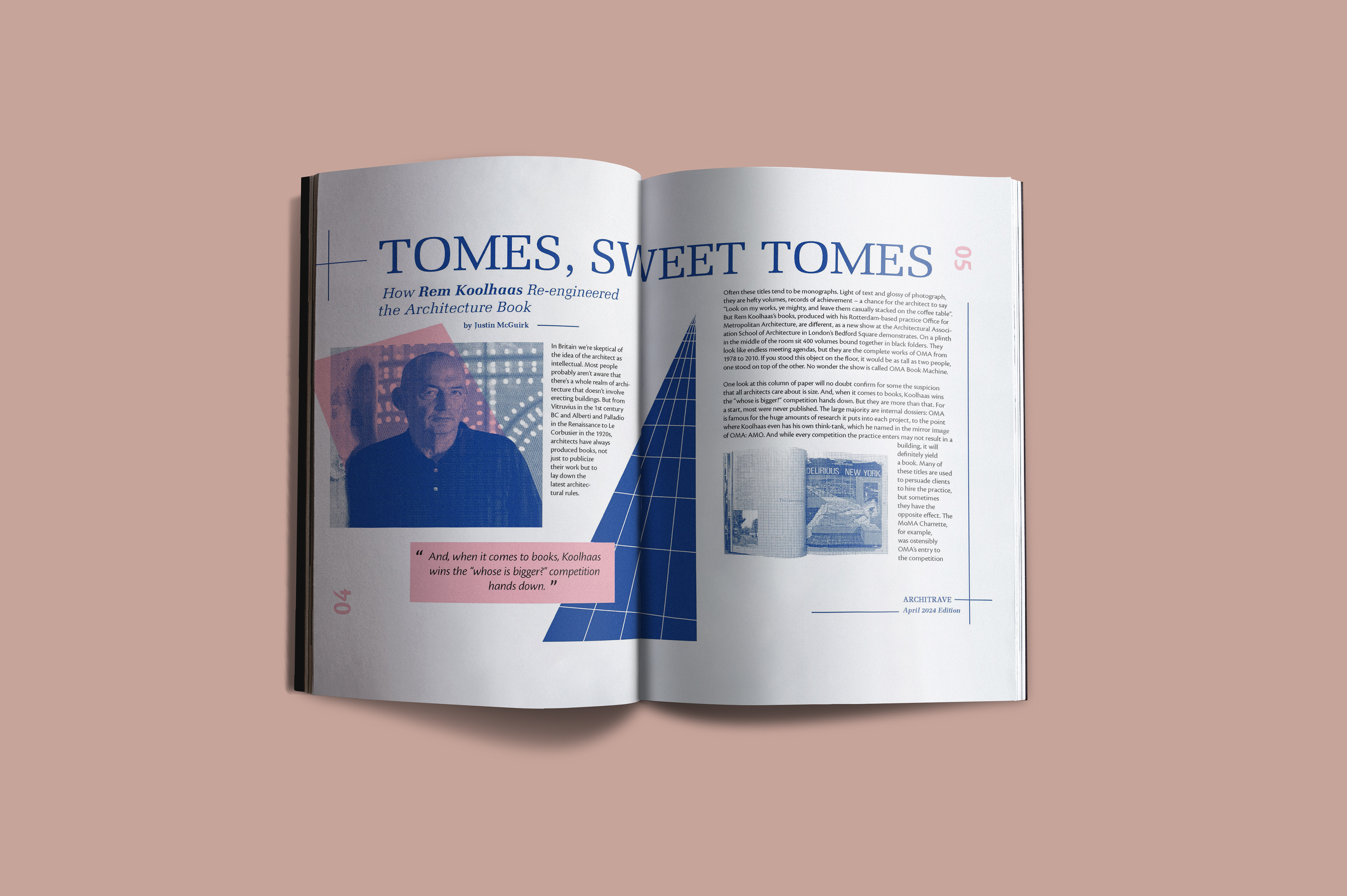
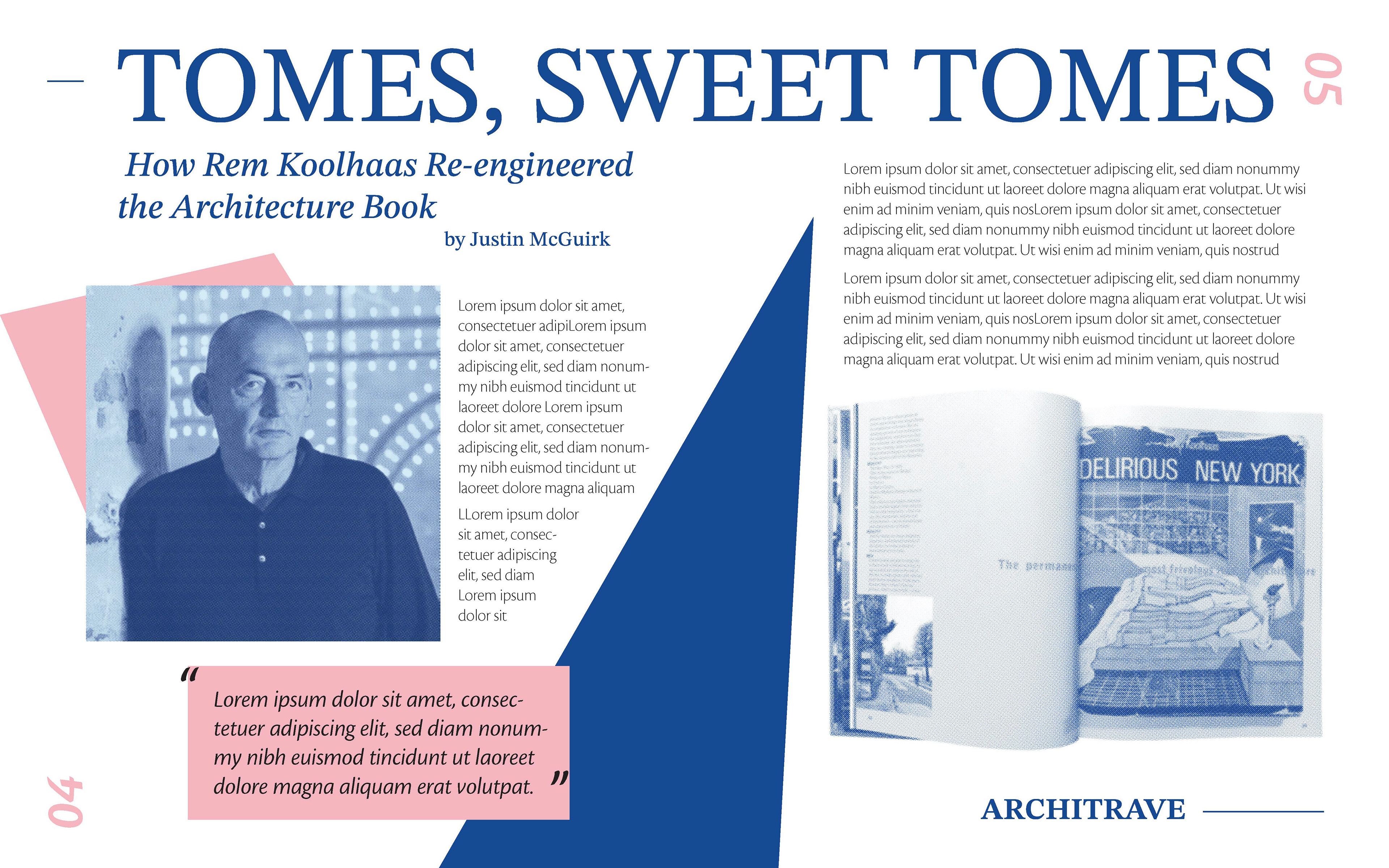
For this simple two-page magazine spread, I was assigned an article written by Justin McGuirk on Rem Koolhaas' architectural book entitled S,M,L,XL. I was required to include all provided copy, including the title, subtitle, author, magazine title, edition, and body copy, as well as folio.
Other limitations included utilizing only two spot colors for the final print, as well as two required typefaces, Melior and Cronos Pro.
My final solution incorporated a strong blue color complimented by splashes of pink, giving the majority of the spread a "blueprint" kind of look to emphasize the architectural themes covered in the article copy. I also used bit-mapped images and added a duotone effect to them to give the spread a bit more visual interest.
PROCESS
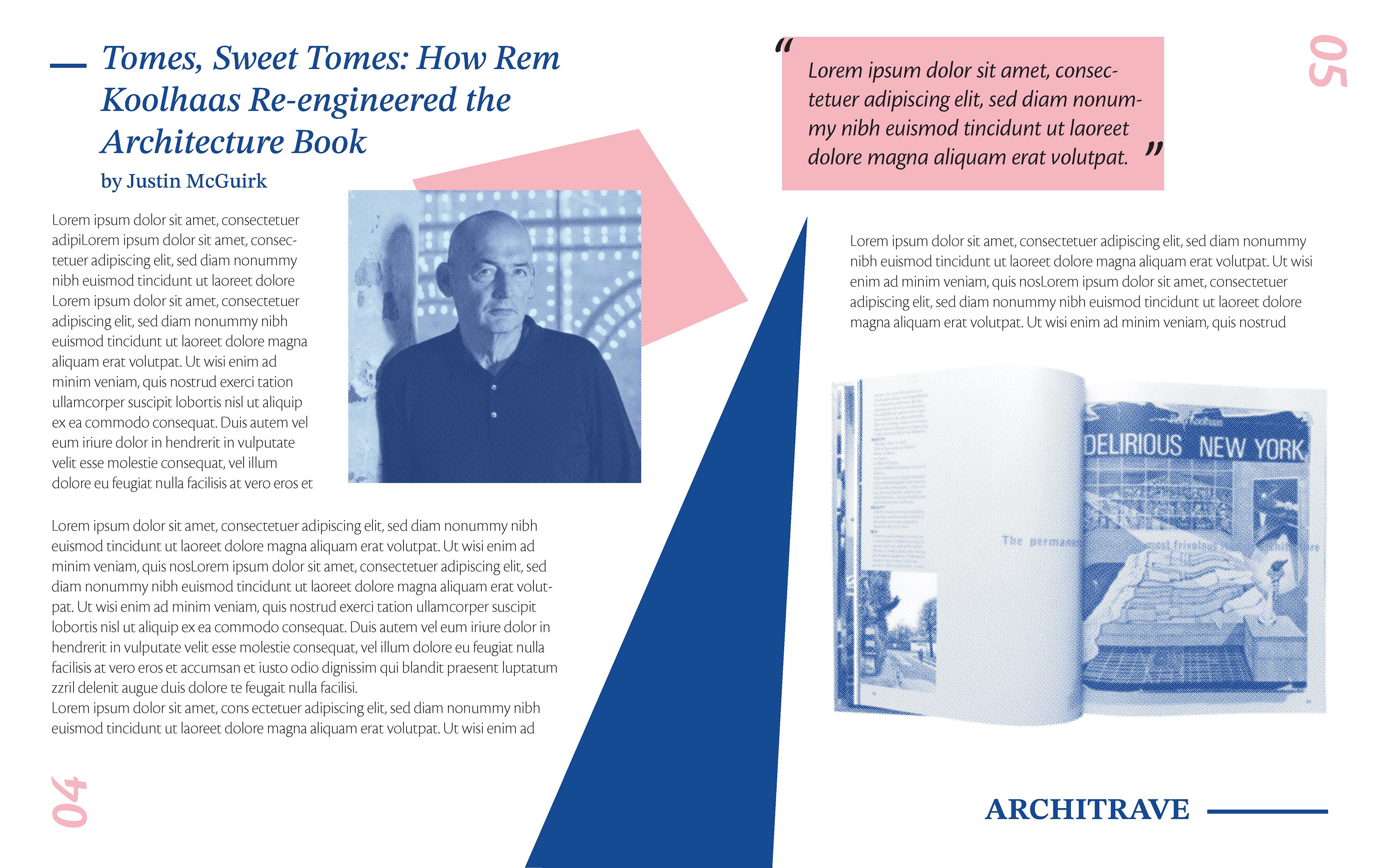
1ST ITERATION
2ND ITERATION
In my early compositions, I played a lot with the size and arrangement of the elements, trying to balance the images with the text and additional shapes on the page. From the second draft to the final, I refined the placements of the page elements, incorporated more lines, added more typographic contrast, and shrunk the text size of the "Architrave" magazine title.