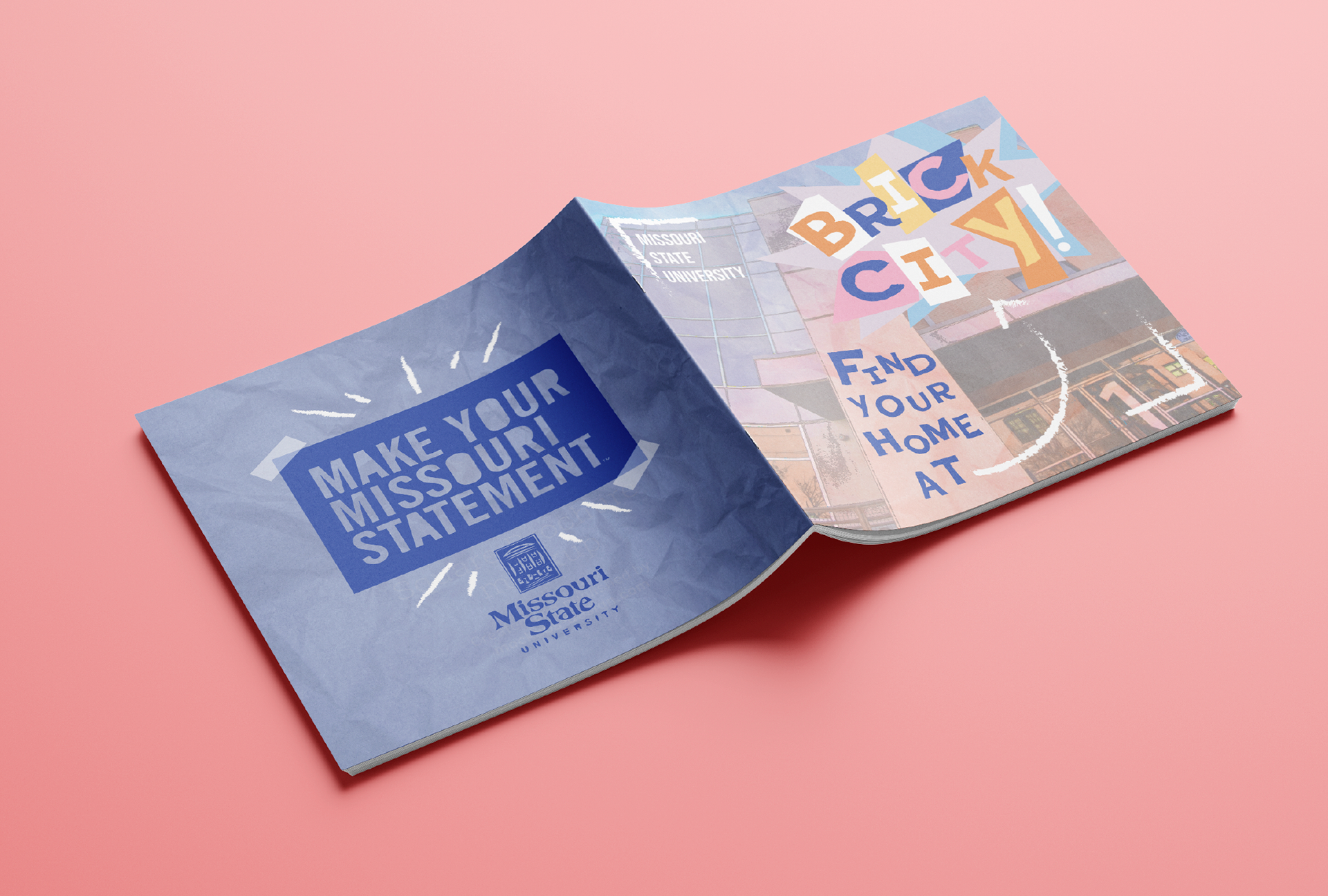
With this project, I was tasked to write and design a promotional booklet for Missouri State University's Art and Design campus, known as "Brick City." I was given complete creative freedom for the copy as well as the overall visual language of the booklet. I went for a sort of collage/paper-cut look for the final 20 page project, incorporating my own photos and illustrations!
For my color palette, I chose a bold blue, pink, orange, and yellow combination to emphasize the bright, fun, creative environment Brick City offers Art and Design students.
I also wanted to keep the visual identity consistent by incorporating scrapbook elements such as crumpled paper textures, pieces of tape, sticky notes, collaged images, doodles on photographic elements, and a playful, paper-cut style typeface, Poster Cut Neue. I paired this typeface with my secondary choice, Bebas Neue, used for subheads and small blocks of text, while Helvetica was used for large blocks of text for better legibility.