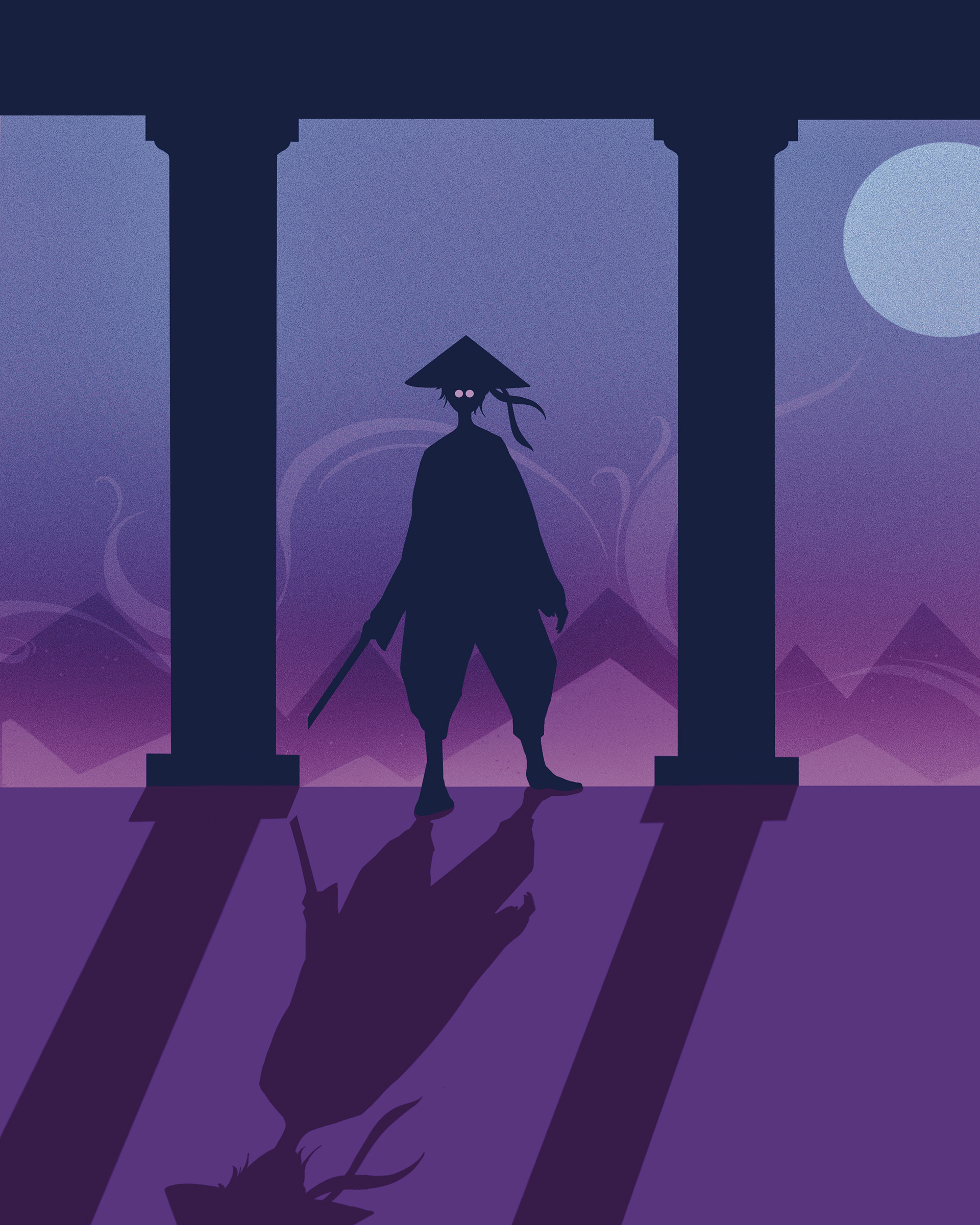
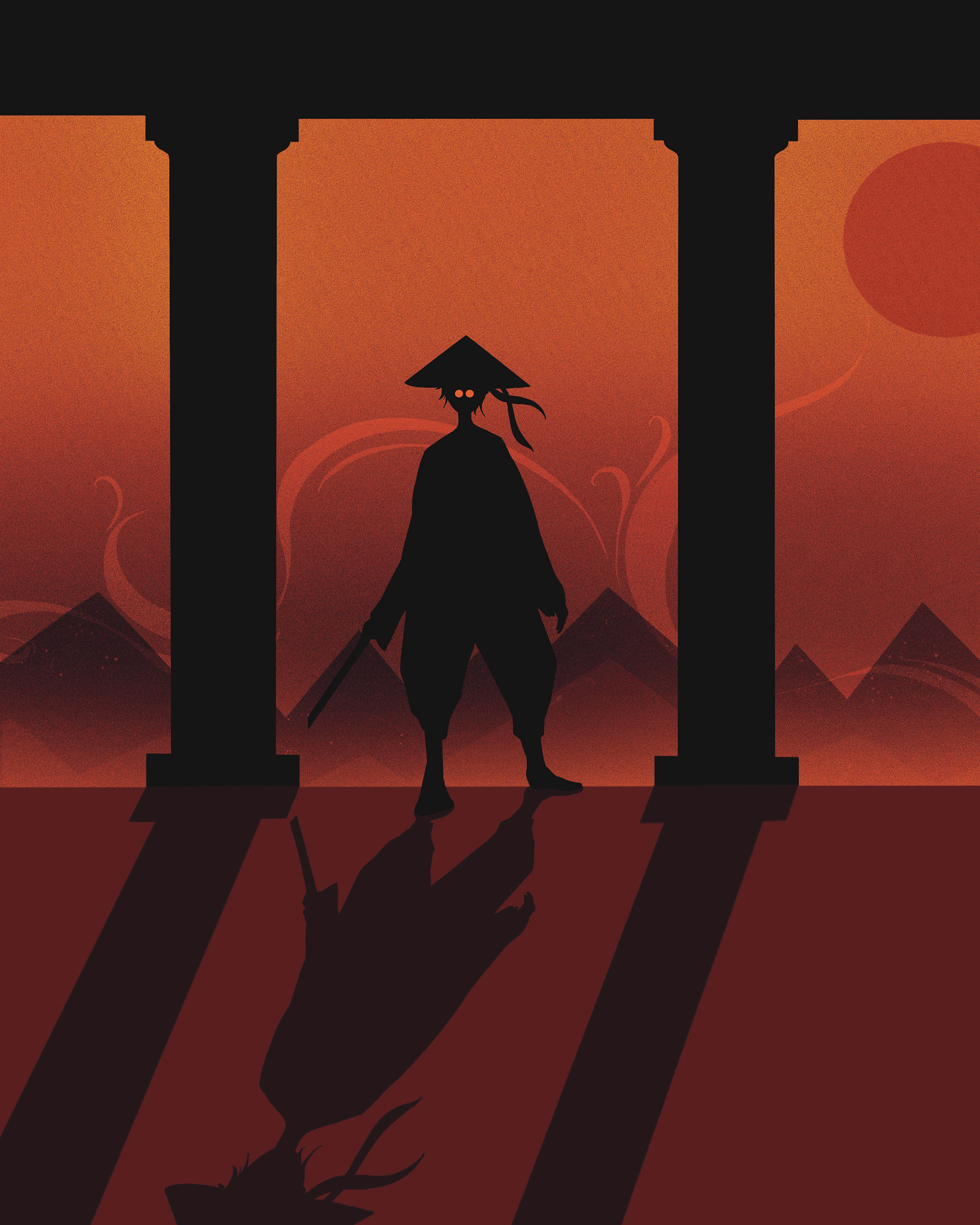
In this project, I was tasked with creating a pair of matching illustrations that were distinguished from one another only in color. Because they needed to set contrasting tones based on the color choices, my goal was to create a scene that could be read as both serene and intense.
In my left iteration, I utilized cool tones to make the environment seem more still, peaceful, and calm, where the subject could be training on a quiet night or returning to a temple after a journey.
My right iteration used more saturated and intense warm tones to change the mood into something more fiery, violent, and energized. The wisps in the background could be interpreted more as smoke from a fire rather than fog or wind, as if the warrior were laying siege to the temple and ready to fight whoever stands in their way.